

A Pie Chart Representing Countries That Got Nuked T-Shirt
A Pie Chart Representing Countries That Got Nuked T-Shirt
Couldn't load pickup availability
Dark History Meets Razor-Sharp Visual Humor
Some graphic tees rely on complicated artwork to get attention. Others need only one circle and one sentence. The A Pie Chart Representing Countries That Got Nuked T-Shirt belongs firmly in the second category, turning a serious piece of modern history into an intentionally stark, provocative visual joke.
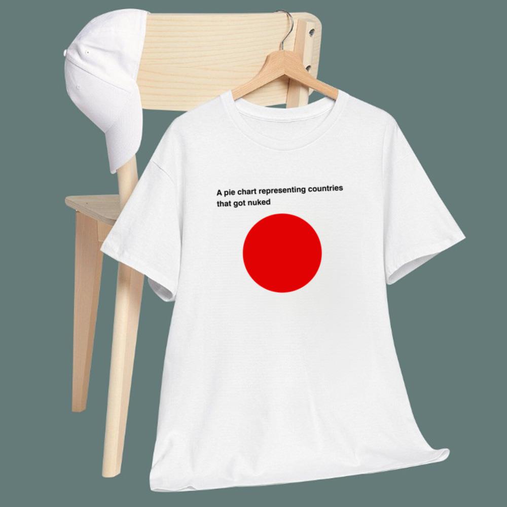
The design features the caption “A pie chart representing countries that got nuked” above a completely red circular chart. Its minimalist presentation makes the punchline immediate, while the historical reference gives the graphic an unmistakably dark edge. It is simple, uncomfortable, clever, and memorable—all qualities that make dark-humor apparel especially effective at starting conversations.
One Red Circle, One Dark Historical Punchline
At first glance, the artwork looks almost like something taken from a statistics presentation: a heading, a pie chart, and no unnecessary decoration. But that simplicity is exactly where the joke works.
The A Pie Chart Representing Countries That Got Nuked T-Shirt uses data-visualization humor to reference the historical fact that Japan is the only country to have suffered atomic bombings in warfare, when Hiroshima and Nagasaki were bombed in August 1945. Because both cities were in the same country, the fictional chart becomes a single uninterrupted segment.
That contrast creates the design's dark humor. A subject associated with enormous historical tragedy is represented through the cold, almost absurdly straightforward language of a pie chart. Rather than presenting a detailed historical illustration, the shirt reduces its visual message to a single red circle—forcing the viewer to understand the reference before the joke fully lands.
The red circle also creates an obvious visual association with Japan's flag, adding another layer to the minimalist composition without requiring additional explanation.
This is not cheerful comedy. It belongs to the internet-driven tradition of dark historical memes, deadpan jokes, anti-humor, and deliberately uncomfortable punchlines. The result is a graphic that can trigger a laugh, a double take, or a conversation depending on who sees it.
For People Whose Humor Comes With a History Lesson
The A Pie Chart Representing Countries That Got Nuked T-Shirt is made for a very particular sense of humor. It fits people who enjoy jokes that require context rather than oversized graphics or obvious punchlines.
History enthusiasts may immediately recognize what the chart represents. Meme fans will appreciate the intentionally low-effort presentation. Data nerds and statistics lovers can enjoy the absurd use of a pie chart for something that absolutely does not belong in an ordinary business presentation.
It can especially appeal to fans of dark humor, history memes, minimalist graphic shirts, deadpan comedy, statistics jokes, unconventional conversation starters, and internet-inspired apparel.
The clean white-shirt presentation also gives the joke plenty of visual breathing room. The red circle becomes the focal point while the black caption delivers the setup, creating a minimalist aesthetic that can be worn casually with jeans, shorts, sneakers, or layered beneath a jacket.
Unlike a design that explains itself immediately, this one rewards people who understand the reference. That “you either get it or you don't” quality gives it strong meme potential.
Definitely Not Another Boring Graphic Tee
Buying for someone obsessed with history and dark humor can be difficult because ordinary gifts often feel too safe.
The A Pie Chart Representing Countries That Got Nuked T-Shirt takes the opposite approach.
Its strength is its unexpectedness. Imagine someone opening a gift, seeing what appears to be an innocent pie chart, reading the caption, and then realizing what the completely red circle means. That delayed reaction is precisely what makes the design memorable.
It can make an unconventional birthday, holiday, graduation, or just-because gift for a close friend who loves historical trivia, obscure memes, statistics humor, or provocative comedy. It can also work especially well as an inside-joke gift between friends who already know each other's boundaries and sense of humor.
And that last point matters: the historical subject behind the joke involves catastrophic loss of life, so this isn't the kind of shirt everyone will find funny. For the right recipient, however, its combination of historical reference, minimalist design, and extremely dry humor makes it far more distinctive than another generic novelty tee.
Great novelty gifts don't disappear into a closet.
They become the shirt everyone remembers.
Add It to Your Collection Today
There are loud graphic shirts, complicated graphic shirts, and then there are designs capable of delivering an entire punchline with one circle.
The A Pie Chart Representing Countries That Got Nuked T-Shirt is built for the third category.
Minimalist enough to catch the eye and provocative enough to make people look twice, this design transforms historical context and statistical visualization into an instantly recognizable piece of dark meme humor. It's a statement shirt for people who prefer their comedy dry, unexpected, and several shades darker than average.
If your wardrobe already has enough predictable graphics, make room for something people won't forget five minutes later.
Grab the A Pie Chart Representing Countries That Got Nuked T-Shirt today, wear the world's darkest pie chart, and let one brutally simple graphic do all the talking.